

The Psychology of Colour in Interior Design: Transforming Spaces with the Power of Hues
Colour is one of the most powerful tools in an interior designer's skillset. Colour has the power to dramatically alter the perception of space, evoke a wide range of emotions, and influence behaviour.
Therefore, understanding the psychology of colour helps to create interior spaces that not only look aesthetically pleasing, but also promote well-being, functionality and an emotive experience. In this week’s blog, we delve into the fascinating world of colour psychology and start to explore how it can be applied in interior design to create harmonious and impactful spaces.
Over our 35+ years of practicing Interior Design we have learnt that everybody has an inbuilt colour palette, colours you are naturally drawn to. Take a look around, what colours have you naturally surrounded yourself with? Are you a Red/Green person or do you prefer Blues? Are typically neutral tones your go to with a slight hue of yellow warmth? It’s an interesting concept and one to be mindful of as you embark on your interior design journey.

Understanding Colour Psychology
Colour psychology studies how hues influence human behaviour and emotions. It has been found that particular colours can evoke different feelings and reactions. We’d like you to consider, at this point, that colour is subjective and we believe it to be highly-personal. Therefore, keep in mind colour psychology is a theory and with theories there are always exceptions to the rule.
For instance, blue often promotes calmness and stability, while red can be associated with incite passion and energy. The psychological impact of colour is shaped by nature and nurture; ranging from cultural, personal, and contextual factors, making it a complex, highly personal, and therefore an essential consideration in interior design.
Key Colours and Their Psychological Effects
Colours are fascinating and people respond differently to varying hues. Throughout this next section we’d encourage you to reflect on how each colour makes you feel. Think about the spaces or objects you’d associate that colour to feature, and whether you agree or disagree with some of the colour theories.
Red: Energy and Passion
Red is often described as dynamic and intense, a colour that can stimulate the senses and raise energy levels. It is often used to create a sense of excitement and passion. In interiors, red can be used in dining rooms to stimulate appetite and conversation or in living rooms to foster a lively atmosphere. However, due to its intensity, it is best used as an accent rather than a dominant colour. There’s a great trend circulating at the moment ‘The unexpected red theory’, this approach is you can add the colour red to any space and it just works. Now the caveat is red should be used as a highlight or feature colour. This spans from a simple cushion to a red ceiling, and everything in-between. So, if you’re looking to add a spark to a space, perhaps it’s time to explore a touch of red?
Blue: Calmness and Serenity
Blue is associated with calmness, trust, and stability. It is a popular choice for bedrooms and bathrooms because it promotes relaxation and tranquillity. Lighter shades of blue can make a space feel airy and open, while darker blues can add a sense of depth and sophistication. Blue's soothing properties make it ideal for spaces intended for rest and rejuvenation. Be careful when exploring the spectrum of blues, they can leave a space feeling quite cold. If you’d like to utilise our colour expertise, please feel free to contact us and book in a colour consultation.

Yellow: Happiness and Warmth
Do you feel uplifted when you see yellow? Think of sun, flowers, warmth, natural daylight. Yellow is described as a cheerful and uplifting colour that can bring a sense of happiness and warmth to a room. It is perfect for kitchens, dining areas, and playrooms where a lively and welcoming atmosphere is desired. However, too much yellow can be overwhelming, it can close in a space, so it is often best used in moderation as an accent colour.
Green: Balance and Harmony
Green is the colour of nature and is often associated with balance, harmony, and renewal. Across the full spectrum of green, it commonly has a calming effect and can create a restful environment, making it a great choice for bedrooms and living spaces. Green also promotes concentration and is often used in home offices and study areas. Its versatility makes it suitable for nearly any room in the house. Green is a great highlight colour too, in the form of fabrics, paints, wallcoverings but also accessories such as real plants. As you may know we, Sue Scammell Interiors, are advocates of indoor plants. They not only add organic shapes and life to a space but they also help with purifying the air quality in your property, improving wellbeing and mindfulness – bliss!
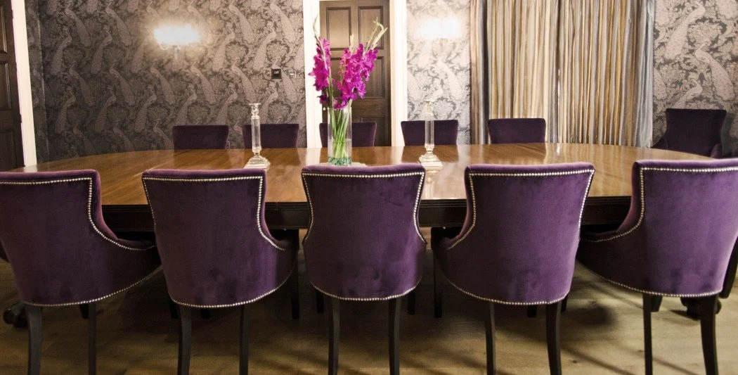
Purple: Luxury and Creativity
Purple, from our experience are leading designer in Devon, is a marmite colour. You either love it or hate, or you think you don’t like it but actually its more of an association thing and its secretly snuck into your intrinsic colour palette… you wouldn’t be the first.
Purple has long been associated with high-end due to its historical importance and rarity. Closely linked with royalty, luxury, and creativity. Purple can add a sense of drama and sophistication to a space. Lighter shades of purple, such as lavender and lilac, have a calming effect, similar to blue, making them suitable for bedrooms. Deeper shades like plum and eggplant can create a rich, luxurious ambiance in living rooms and dining areas. If you’re looking to say ‘luxury’ purple might be for you!
Orange: Enthusiasm and Warmth
Another warming tone associated with the warm rays of summer and the cosiness of Autumn. Orange combines the energy of red and the happiness of yellow, making it a vibrant and enthusiastic colour. It is often used in spaces where social interaction and activity are encouraged, such as living rooms and kitchens. Orange can also stimulate creativity and is a good choice for home offices and creative spaces. Like red, it is best used as an accent colour to avoid overwhelming the space. Although we have seen some very special rooms where colour drenching in orange has look spectacular!
Neutral Colours: Versatility and Elegance
Neutral colours, including white, beige, grey, and black, provide a versatile foundation for any interior design scheme. They can create a sense of balance and elegance and are often used to make space for other colours and design elements. Neutrals can make a room feel clean and spacious, and they are timeless choices that can adapt to various styles and trends. However, even neutrals have hues of red, blue and yellow so be careful to select the right tone to satisfy your palette.

Once you know your colours…
How you do apply Colour Psychology into your Interior Design plans?
This is where our functional and practical approach comes into play. Our award-winning interior design approach isn’t just about creating fabulous looking spaces, it’s very much about creating properties with intention and applying solutions to allow you to use that space with ease. Colour is no different, it’s important to think about what you want your room to deliver, what emotions do you want to feel when you walk into that space.
Mood and Atmosphere
The mood and atmosphere of a room can be significantly influenced by the colours chosen and how you pair colours together. For instance, a calming bedroom can be achieved with cool blues and greens, while a vibrant living room might incorporate warm reds and oranges. Designers often use colour to set the tone of a space and ensure it aligns with its intended function. What are your intentions for this space? How do you want it to work for you?
Enhancing Spatial Perception
Colours can also affect the perception of space. Light colours such as white and pastels can make a room appear larger and more open, while dark colours can create a cozy and intimate feel. Carefully placing colours in a room can help address spatial challenges and enhance the overall flow of a home. It can also help when designing multi-functional spaces, creating modules and define areas within a space without requiring physical boundaries or objects.
Personalising Spaces
Colour is a powerful tool for personalisation. Different individuals and cultures have unique preferences and associations with colour. As experienced designers we tailor colour schemes to reflect your personality and lifestyle, making the space feel truly personal and unique to you.
Complementing Architectural Features
Colour can be used to highlight or downplay architectural features. For example, painting a feature wall in a bold colour can draw attention to it, while using a neutral palette can help blend less desirable elements into the background. This strategic use of colour can enhance the architectural integrity of a space. This is particularly useful when working in period properties and inheriting a space that not necessarily feels like yours.
Colour Trends in Interior Design
Keeping up with colour trends can help create a modern and stylish interior. It’s always good to be aware of trends, however we would encourage you to be in tune with what you like, so your scheme embraces longevity, saving you money in the long run but most importantly so the end result really feels like your space.
Some current trends in colour psychology and interior design include:

Biophilic Design
Biophilic design incorporates natural elements into interiors to promote well-being. Colours associated with this trend include earthy greens, browns, and neutral tones. These popular colours, create a calming and restorative environment that connects residents with nature, bringing the outside in.
Moody Hues
Perhaps you’re looking for more depth and boldness in your interior design plans. Opting for deep, moody hues like navy blue, emerald green, and charcoal grey might be for you. These colours are trending for their ability to create dramatic and sophisticated spaces. Often used in combination with metallic accents and rich textures these colours elegantly create depth and luxury to a space. Be careful with bold colours, can your room embrace the low lighting dark colours deliver?
Warm Neutrals
As we transition into autumn warm neutrals are most welcome. Colours such as beige, taupe, and soft terracotta are making a comeback, offering a cozy and inviting alternative to cooler greys. These colours create a warm, comforting ambiance and pair well with natural materials like wood and stone. When you achieve a great foundation colour for your overall colour palette, it truly makes the whole process much more seamless.
Bold Accents
Bold accent colours like mustard yellow, coral, and teal are being used to add vibrancy and personality to interiors. These accents can be incorporated through furniture, artwork, and accessories to create dynamic and lively spaces. Accent colours are a really great way to play with colour, explore different combinations through the use of movable accessories to experiment with what works and what doesn’t.
More from the functional side of interior design…

Practical Tips for Using Colour in Interior Design.
Start with a Neutral Base
Using a neutral base allows for flexibility and easy updates. It’s the relatively low-cost option to start a transformation. Neutral walls and larger furniture pieces can be complemented with colourful accents that can be changed according to trends or personal preferences. Accessories are a great way to start introducing colour and experimenting with how colour makes you feel within a room.
Consider Lighting
Lighting plays a crucial role in interior design full stop. It is particularly important to consider how colours appear in a space. The classic mistake so many people make is looking at a colour outside of the space they intend to use it. Depending on which way the room faces (north, eats, south, west) and the amount of light that naturally travels through the space will depend on the hue of light and colour in that room. Natural light, artificial light, and the direction of the light source can all influence the perception of colour. It is essential to consider lighting conditions when choosing colours to ensure they achieve the desired effect.
Use Colour to Define Zones
In open-plan spaces, colour can be used to define different zones and create a sense of structure. For example, a different colour scheme for the dining area and the living area can help distinguish these spaces while maintaining a cohesive overall design.
Test Colours Before Committing
Test, test, test. We like to help you get the most cost-effective solution for your interior design projects. With that in mind, before committing to a colour, it is wise to test it in the space first before committing. Paint samples on the wall or use large swatches to see how the colour interacts with the lighting and other elements in the room. Live with it for a while, see how it looks at different times of the day and night. What does it look like if you place it next to different furniture and walls? It does take patience, but this method can help avoid costly mistakes and ensure the chosen colour achieves the desired effect.
Balance Bold Colours with Neutrals
Top tip, when using bold colours, balance them with neutrals to avoid overwhelming the space. Bold colours can be used as accents in furniture, artwork, or accessories, while neutral backgrounds provide a calming contrast. Neutrals do not have to be beige and white, they range through the whole colour spectrum, be mindful of colour combinations as they will also change a colours appearance.
Summary
We hope you agree the psychology of colour is a fascinating and having a basic understanding of how colours impact our mood, emotions and experience within a space is an essential aspect of interior design. By understanding how different colours influence emotions and behaviour, we can help you create spaces that are not only beautiful but also functional and harmonious. Whether aiming for a serene retreat or a lively gathering place, the considered use of colour can transform any space into a reflection of its inhabitants' needs and desires. If you would like support with your interior design project, please contact us via our online form or feel free to call us on 07771 578459.
For more insights into the latest interior design trends and tips on creating your dream space, visit Interior Design Trends and Psychology of Colour. Embrace the power of colour and unlock the potential of your home